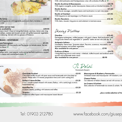
Muse Yourself

MuseScreens

Muse Yourself is a composition tool in the form of an interactive digital art installation.  It loops a live camera and projector via a piece of code written in Processing language which allows the user to ‘burn’ their photographic image into the canvas by pressing against it.

OLYMPUS DIGITAL CAMERA

OLYMPUS DIGITAL CAMERA

An infinite number of photographic layers can be burnt into the canvas although older layers soon deteriorate.  This distortion is not artificial but due to feedback and loss of resolution as the equipment tries to re-sample and reproduce each successive layer. It’s the same kind of thing you see if you point a digital video camera at an LCD screen, or comparable to the way notes deteriorate when played through a digital delay pedal.

Above being just a fun painting tool, Muse Yourself plays with the distinctions between gallery visitor, subject, artist and artwork. By using the tool you do, to an extent, play all of those roles at once.

In the gallery, each finished image lasts only until someone decides to restart the process, beginning with a blank screen. However the program is easily able to store images for posterity; here are a few samples:

MuseComp1

MuseComp2

MuseComp3

Charity Golf Day

Year

2013

Client

Rockinghorse et al.

Project

Design and illustration of an A5 printed flyer

This design used variations of the ‘Neutra’ font, taking inspiration from posters of the 30s and 40s.  The green blobs are a tracing of the course map for the first hole at West Hove Golf Club.

Golf_Day

Giuseppes Juniors

Year

2013

Client

Liotru / Giuseppes

Project

Design and illustration of a new Kids Menu and Colouring Sheet

This project included an open brief to design cartoon characters in place of two Italian chefs.  The ‘Pasta People’ retained a sense of Italian identity while avoiding old-fashioned stereotypes.

GiuseppesJuniors


GJrsColouringSheet


Previous menu: KidsMenuOldsmall

Giuseppes Menu

Year

2013

Client

Liotru / Giuseppes

Project

Revision of A1 menu poster

This Sicilian Italian restaurant has a wide range of dishes meaning the old menu was difficult to navigate.  The new design was a subtle update to the brand identity and a much clearer structure.

GiuseppesA1Menu

Previous menu:

GiuseppesOldMenu


Rockinghorse / Posh Totty

Year

2013

Client

Rockinghorse / Posh Totty

Project

Pin badge cards

Three types of card for displaying the silver-plated Rockinghorse pin badge made by Posh Totty Designs: gratuity, point-of-sale and special occasion placecard.

PoshTottyCards2


TottyPic


Singing for Pleasure

Year

2013

Client

Singing for Pleasure

Project

Branding, promotional postcard

A double-sided postcard to promote a charity fundraising event in 2014.  The ‘Singing for Pleasure’ logotype was created to recall a 1960s/70s Easy Listening LP.

SingingForPleasurePostcard


flickratio.com

What?

The website www.flickratio.com is a data visualisation tool I built in 2012 to analyse the aspect ratios used by people uploading images to the internet.

flickratio_tm

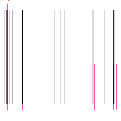
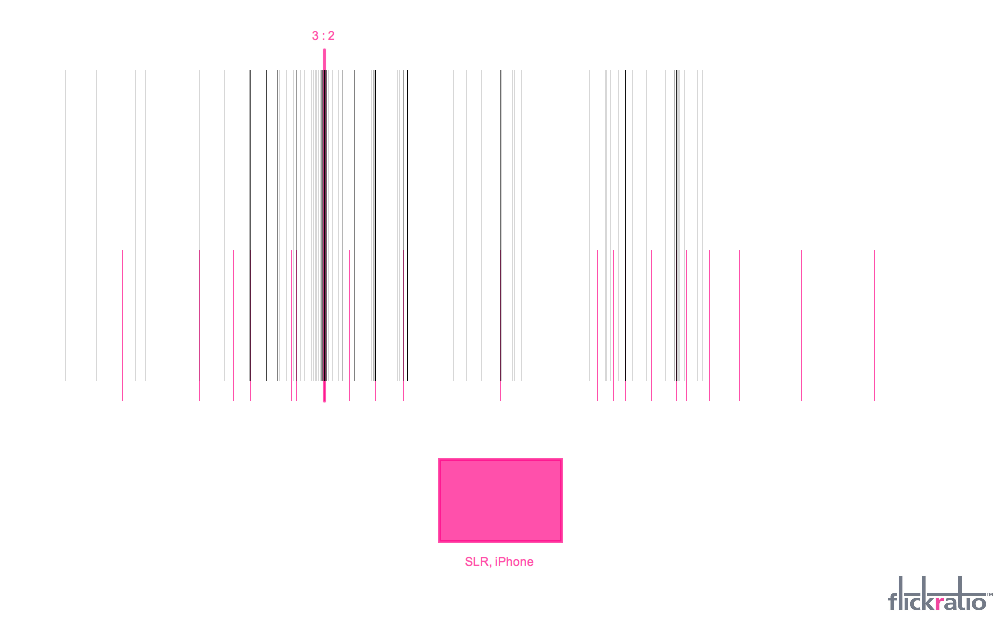
It displays image data based on a user-defined keyword (just like in a regular image-search engine), but instead of displaying the images themselves in order of relevance, it plots each one as a line according to its aspect ratio.  So, ‘letterbox’ shaped images are represented on the far-left, panning through the Golden Ratio, 16:9 widescreen, landscape 4:3 until we reach square photographs in the middle.  Images to the right of centre are the portrait ratios, become increasingly tall until finally the narrowest vertical formats on the far right.  This tool uses the Flickr API data stream and Processing language to ‘process’ the results.

site

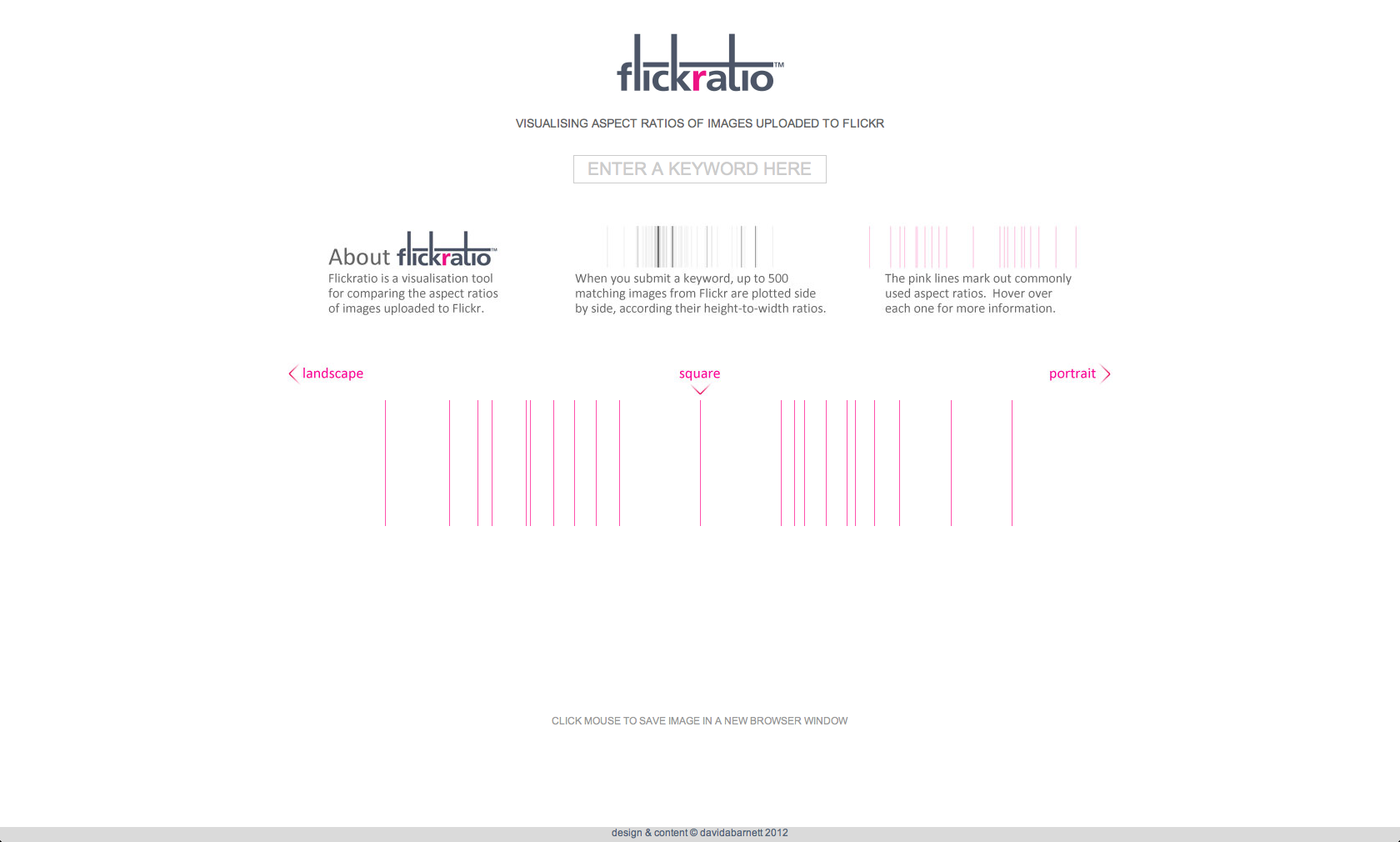
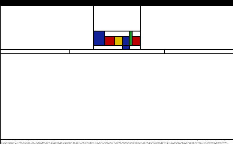
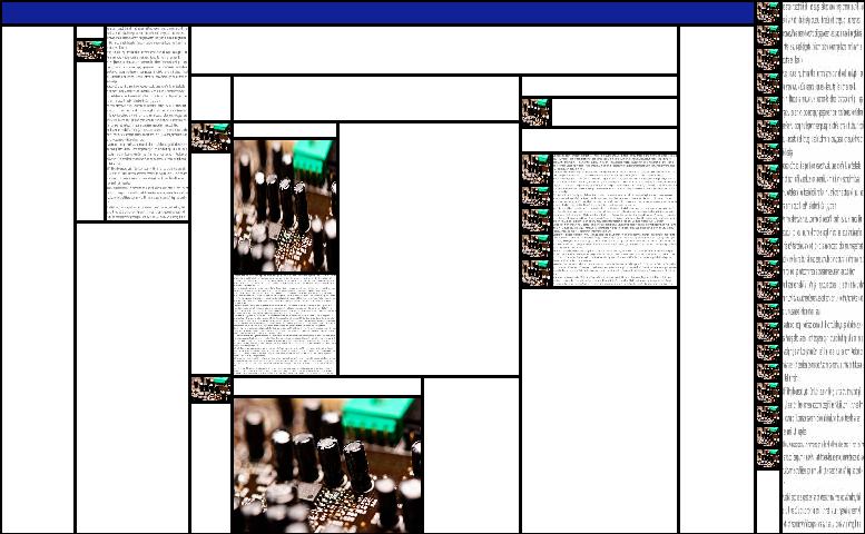
flickratio homepage, 2012

Why?

Social media allows us to do experiments which were previously near-impossible.  In this case we can take a sample of 500 people from across the English-speaking world (assuming we use an English keyword) and observe how they create media – in particular how they interact with aspect ratios.  We can see their decisions and ask questions about what led to them.  For example:

  • Do people tend to pick similar aspect ratios when photographing similar subjects?
  • How many or how few of the images uploaded to flickr have been cropped?  And how does that change according to different subjects?
  • When people crop images, do they produce ratios close to those adopted outside the world of image-capture?
  • Which ratios are popular at the moment?  Are the square images a product of Instagram and Lomography?  Is the iPad helping to preserve the 4:3 format used old televisions?
  • Is there a relationship between the different aspect ratios we use in modern life?  Various ratios were made ‘standard’ over the years because it was felt they were aesthetically pleasing.  Given the mathematical root of ‘ratio-aesthetics’, can we see a pattern?

flickratio_screenshot

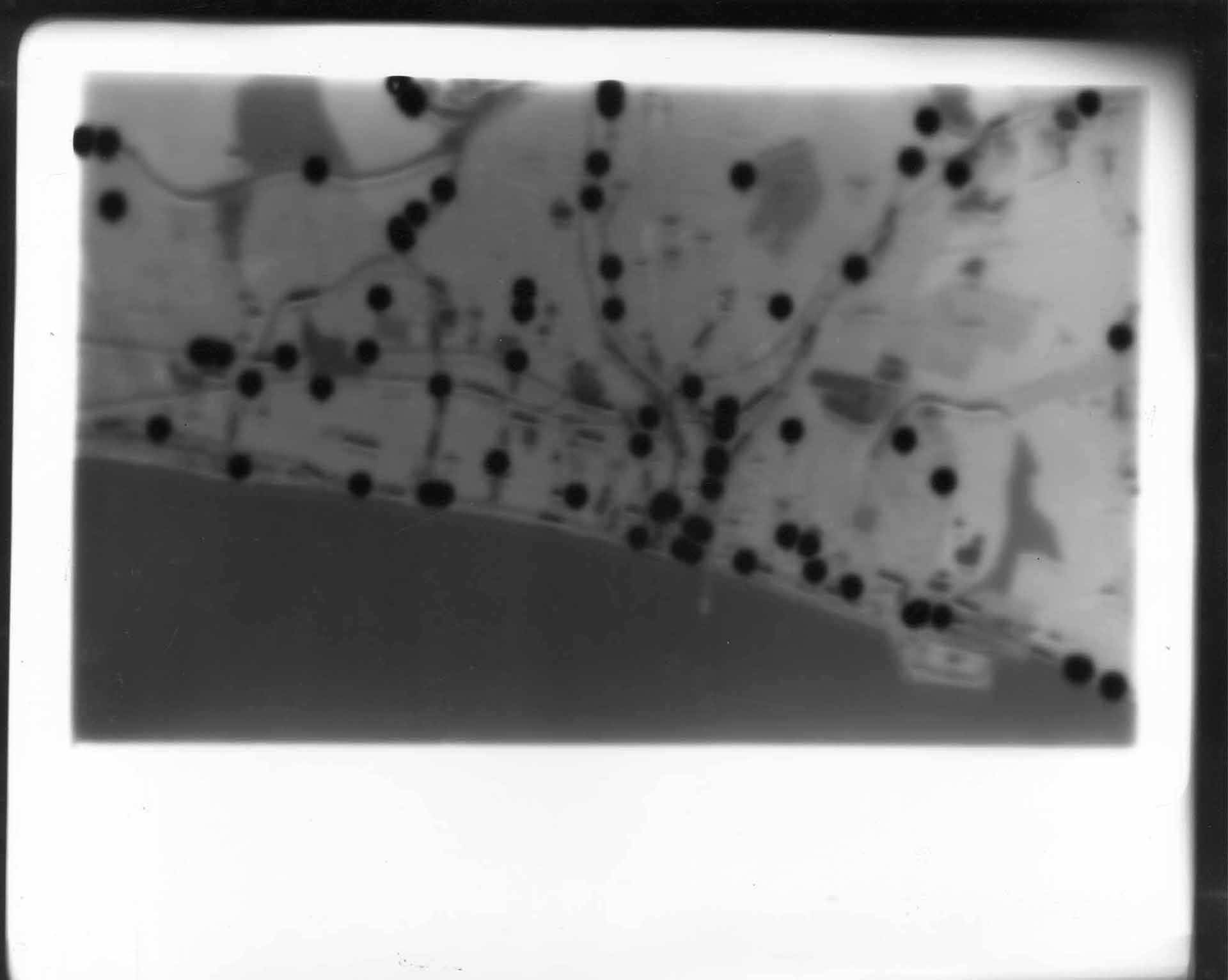
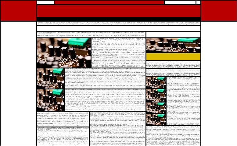
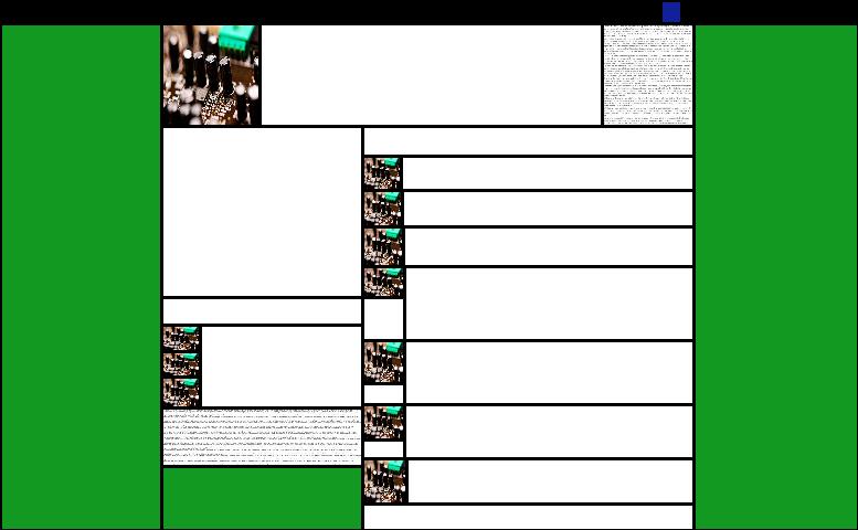
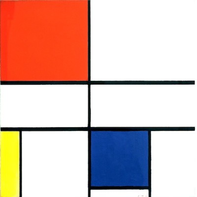
filckratio visualisation (using keyword: “example”), 2012

Can I see the pictures?

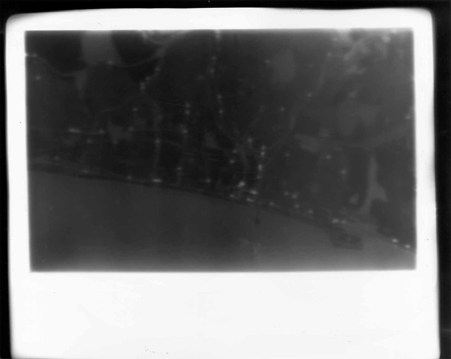
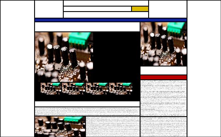
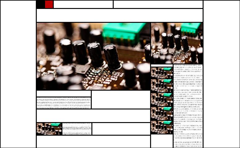
In the development version it was possible to ‘preview’ images by pointing your mouse cursor at the corresponding plot-line, like in the screenshot below; however it caused technical issues when live (crashing) so remains disabled for the moment.

flickratio_beta

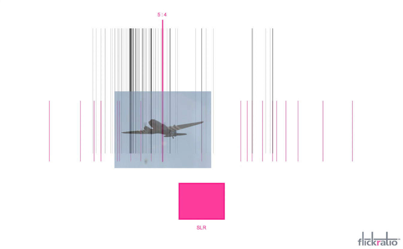
filckratio beta visualisation (using keyword: “aeroplane”), 2012


Blackspots / Deathstars

These images use location data recorded by police crash investigators from 1999 to 2010. Each dot marks a fatality due to an accident on the roads of Brighton & Hove. Medium is photographic paper exposed directly against a monitor screen (sometimes referred to as ‘laptopography’).


Blackspots

‘Blackspots’, 2012 (41 x 51cm)


Deathstars

‘Deathstars’, 2012 (41 x 51cm)


These photographs were exhibited at the MADMA show, at the Phoenix Gallery in Brighton, on the 24-25 February 2012. You can view some footage of the show here.


10 Mondrianised Websites

These mondrianised websites, made with the Mondrian Composer Tool, show how a ‘classic’ html webpage follows Mondrian’s principle of rectangular divisions. Rollover each with your cursor to view the original (may initially take up to a second to load into cache).


Move your mouse over me

1


Move your mouse over me

2


Move your mouse over me

3


Move your mouse over me

4


Move your mouse over me

5


Move your mouse over me

6


Move your mouse over me

7


Move your mouse over me

8


Move your mouse over me

9


Move your mouse over me

10

Key: 1) Google; 2) Bing; 3) BBC News; 4) MSN; 5) Facebook; 6) Twitter; 7) Flickr; 8) YouTube; 9) Amazon; 10) Wikipedia

The screenshots on this page are shown as the sites appeared in February 2012.


Mondrian Composer Tool

This Mondrian Composer tool is based on the Neo-Plasticist or De Stijl paintings of Dutch abstract artist Piet Mondrian. It was created to explore the geometry that occurs within rectilinear html websites.

As well as black or white paint-fills, this composer offers the colour addition palette of De Stijl (red/ yellow/ blue), plus green to make up the colour subtraction palette (red/ green/ blue). To compose ‘webpage’ layouts, it is also possible to fill spaces with image or text.

Try it for yourself…

Click in the box to draw horizontal and vertical lines. New lines are naturally perpendicular, so clicking nearest to a vertical line will create a horizontal line – and vice versa.

Press C to clear the canvas and use the keys below to switch between lines and fills:

L – draw lines   X – black   W – white   R – red   Y – yellow   B – blue   G – green   T – text   I – image